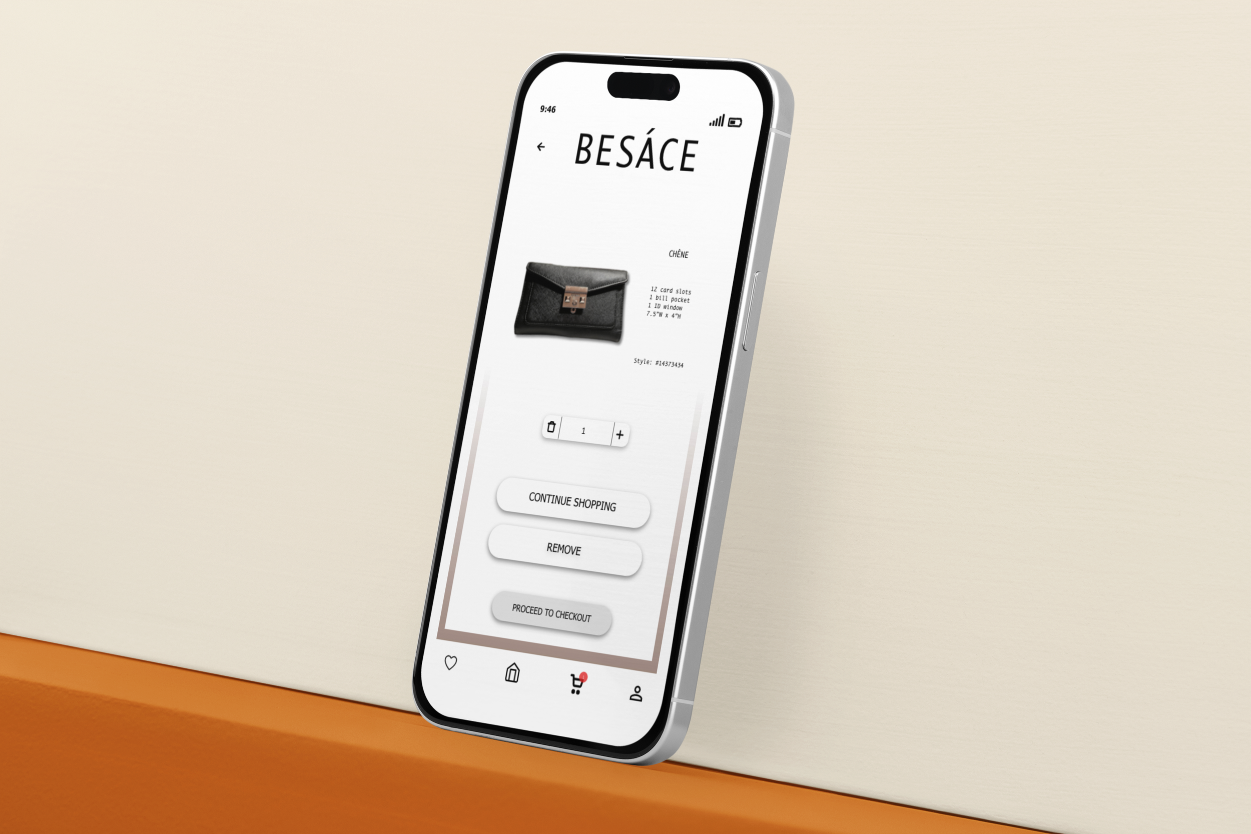
Besáce
Where Luxury Meets Functionality
The Besáce app was developed for the company of the same name for e-commerce purposes. The company requested an app that would emulate their in-store experience, simple yet luxurious.
Role
I was head of the entire design of the Besáce app. From the user research to the interface design.
Concept
Develop an app that creates a shopping experience of Besáce wallets. The interface should be sleek yet simple. The colors are to be understated to keep focus on products.
Problem
The company Besáce needs an e-commerce website to drive more traffic and provide convenience.
Question
How can Besáce develop and online presence and drive traffic?
Goal
Create an app that customers can use to shop from the convenience of their home.
-
User Needs
•Easy checkout
•Payment options
•Search for product
-
Target Audience
•Ages 13+
•Fashion forward
•Online shoppers
-
Functionality Requirements
•Simple UI
•Place Order
•Ease of navigation
Strategy
Flow map
Wireframes
User Research
User Testing
During user testing I interviewed three women of various ages and demographics. I gave them the task of selecting the Chéne wallet, adding it to the cart and then checking out.
SHREYA
“Looks really good and the task flows well all throughout (especially at the payment) There's nothing in particular that I would suggest changing.”
KATE
“I enjoyed having the menu at the bottom of the page and the search feature being at the top center making that a priority. Going through the purchasing of the wallet, I found it easy. For the first purchasing page, I would bring everything below the picture up a little so it means less scrolling for purchasers. I also love the save button but I would add the heart icon next to save for later so people can put two and two together. As well as when I click add to cart I think that the page should stay where I clicked it because I was confused for a second. Love the cart page, shows you everything that you need, as well as the card payment.”
MELISSA
“Use own images as it gets confusing to navigate to the cart .”
Before and after user testing.
Takeaways
Some users found the given task aimplw while some had issues actually scrolling down to the navigation bar. One user found it confusing to navigate through the low-fidelity wireframes.
Elements
Color Harmony
Brandmark
Buttons
Typefaces
Icons
Thumbnail


