Embodimend

Recovery, one day at a time.
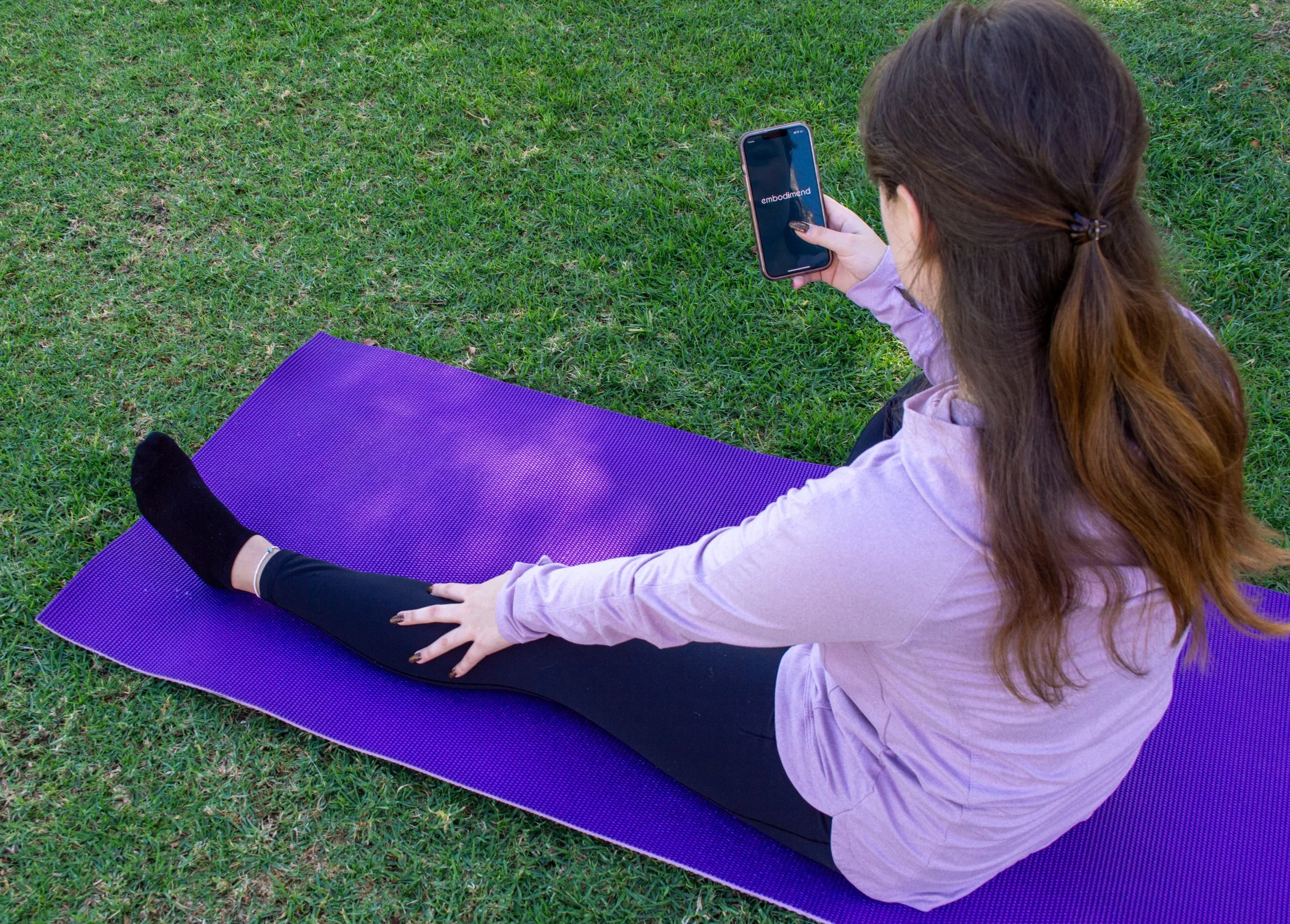
Embodimend is an app designed to guide those experiencing muscular and skeletal pain. Embodimend is perfect for those who struggle to get daily exercise in as well as providing a range of stretches. This independently developed design features an easy to navigate interface that users will appreciate.
Role
Within the given three month time span, I was in charge of user research and user interface.
Concept
The purpose is to create a product in which users from all walks of life may use. As this falls into the health and exercise category that app stores use to filter the applications, there must be a range of musculoskeletal areas to target.
Question
How can users receive exercise/stretching without having acess to physical therapy and/or leaving their home?
Problem
Users with ailments, physical disabilities, or mobility restrictions need access to light to moderate exercise to aid in flexibility and rehabilitation without having to leave the house.
Goal
Create a simple and effective way to obtain rehabilitative exercise.
-
User Needs
•Reminders
•Find right exercise
•Navigate with ease
•Correct information
•Categories by pain points
•Videos for following along
-
Target Audience
•Ages 13+
•Adults with busy schedules
•Those seeking at home exercise
•Those without accesss to physical therapy
•Those seeking to ease muscoskeletal pain
-
Functionality Requirements
•Simple UI
•Ease of navigation
•Replay/Loop feature
•Login/Create account capability
•Ability to select reminder times
•Ability to adjust video functions

Site Map
Strategy

Wireframes
User Research
Usability Testing
During usability testing, I interviewed three different people; Maria, Pedro and Ari. All users currently reside in Southern California. I noted demographic and feedback on initial testing.
PETER
“Text too large. Buttons too large. Reminder is nice feature.”
MARY
“I like that I can pick my focus and that there's videos to follow along.”
ARIANNA
“Easy to understand but colors look dated.”


Before user testing
After user testing


Takeaways
Users liked overall purpose of the app and appreciated demonstration videos but were not satisfied with interface components like text size and color story. With users having a varying knowledge of technology, I was pleased to see that navigation was not an issue. However, I went back and completely redesigned the interface to make the app more appealing and modern.

Elements
Color Harmony

Icons

Typefaces

Brandmark

Buttons

Thumbnail